Skriv in dig - Arbetsförmedlingen
Skriv in dig is the signup process every person in Sweden needs to go through to be able to get unemployment funds or other help from Arbetsförmedlingen and the unions. I maintained the current system as a UX designer and got tasked to get started working on a new Skriv in dig application that would replace the current one. In other words, not a new version but a new product.
TL;DR
Summary
Design and accessibility maintenance of current product. Lead Research, UX and accessibility for a new version worked on from the ground up. This new product would entirely replace the legacy version that was maintained.
Outcome
A complete design, after many iterations and interviews. It was ready to develop with complete accessibility reviews, UX writing, UI design. The new design was released during 2023. The new design made it much easier and streamlined for unemployed people to onboard and access the tools they need.
- Timeline: 2020 - 2021
- Roles: UX Designer, Researcher, UI Designer
- Tools: Sketch, Accessibility, Miro
My Role
I was the UX designer and Art Director at the start. Together with a colleague who was a Service Designer we created a new scenario and presented it to the stakeholders to get started and seek funding for the project. As we got the thumbs up our team grew with copywriters, another UX designer and a dedicated Art Director. My role in the more established workforce was prototyping, user testing and general overall lead on the look and feel.
Challenge
The biggest challenges were to innovate and create a new signup process. It had to be based on the questions of the current application for legal reasons and so that it is still compatible with other public agencies. But we were determined not to make this a new version of the current application. Rather, a new application that is going to replace the old one. Build new from the ground up with the latest and most accessible methods and technologies.
Some of the most important drivers for us were:
- Accessibility
- Ease of use
- Motivation
Approach
The current application is very complex and large in scope. A lot of systems have dependencies and a lot of regulations to make the app viable and working. So, we had to break it down. We chunked up the app into parts and went through each piece of the cake to identify dependencies, what we must migrate in some capacity and what we can throw in the bin.
So, when sliced up and ready to go we started designing. Created black and white wireframes and conducted a ton of user tests to see if we were on the right path. And, – Spoiler alert – the designers first “brilliant” idea that “totally makes sense” did NOT go well during the user testing. Proving once again how important it is to be able to kill your darlings and to be aware of your own biases before proceeding with a design choice. Using this approach, we continued with each slice of the project until we had the whole picture before us. We had huge boards in Miro with insights, workshops and design sprints. My computer always sounded like it is about to launch to space when loading the project.
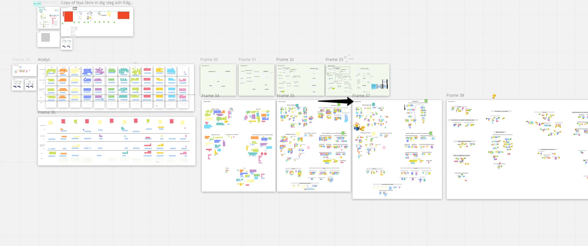
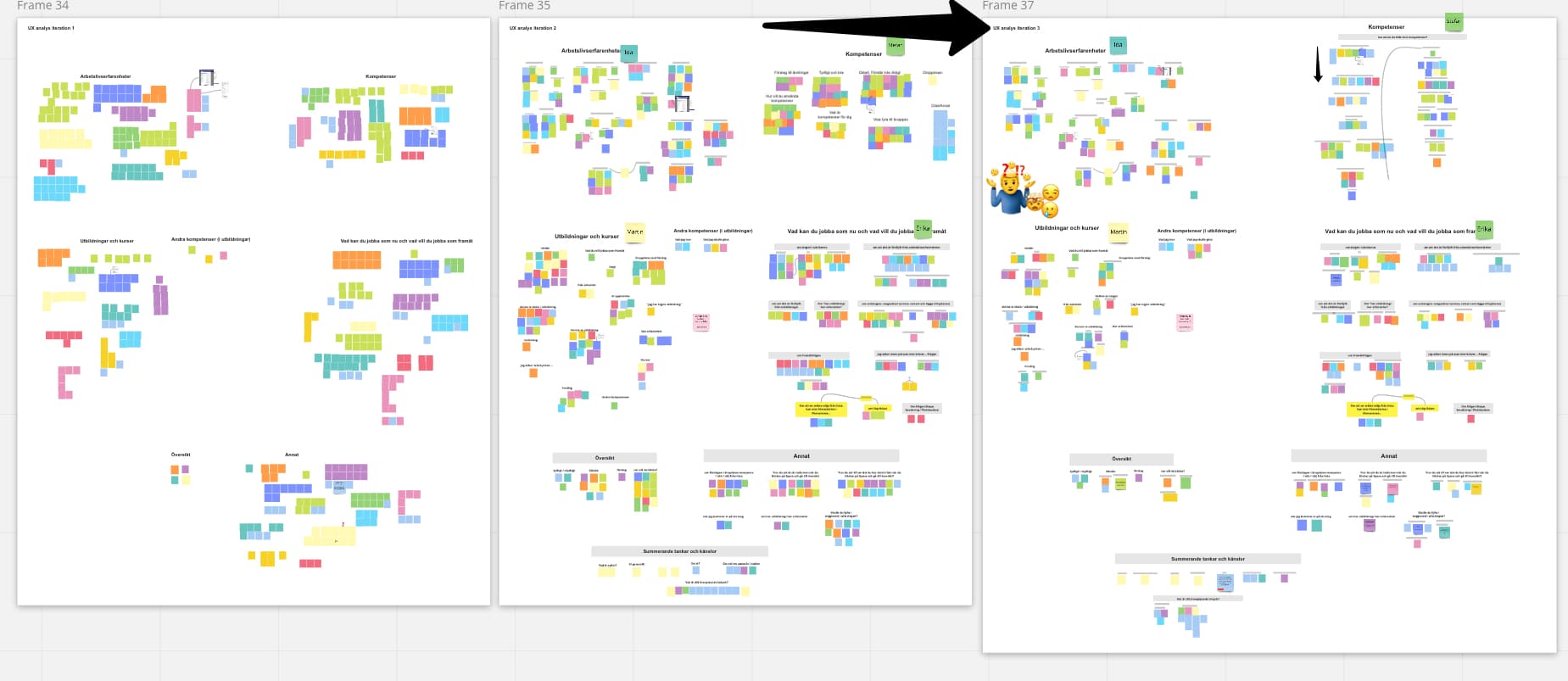
A couple of chaotic screenshots from our user data analyse in Miro:


Result
The result of the project was complete designs of all information that needed to be present in the new signup process. Our art director and copywriter created pixel-perfect designs with amazing and clear texts from my wireframes. It was a strong and sound foundation to be able to develop the application with the ability to mend the design as we go. As I was a consultant this is where my journey ended with this project. I am eager to see what the work will look like in production in the future.
Result update early 2023
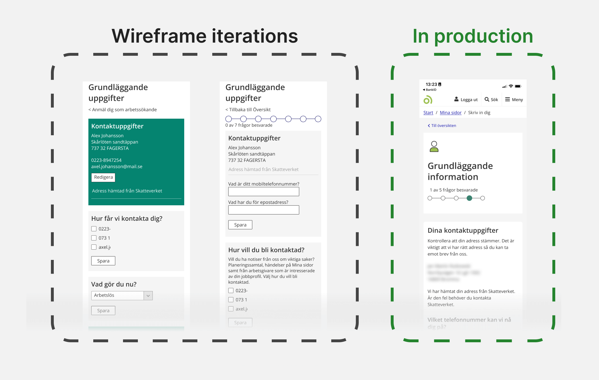
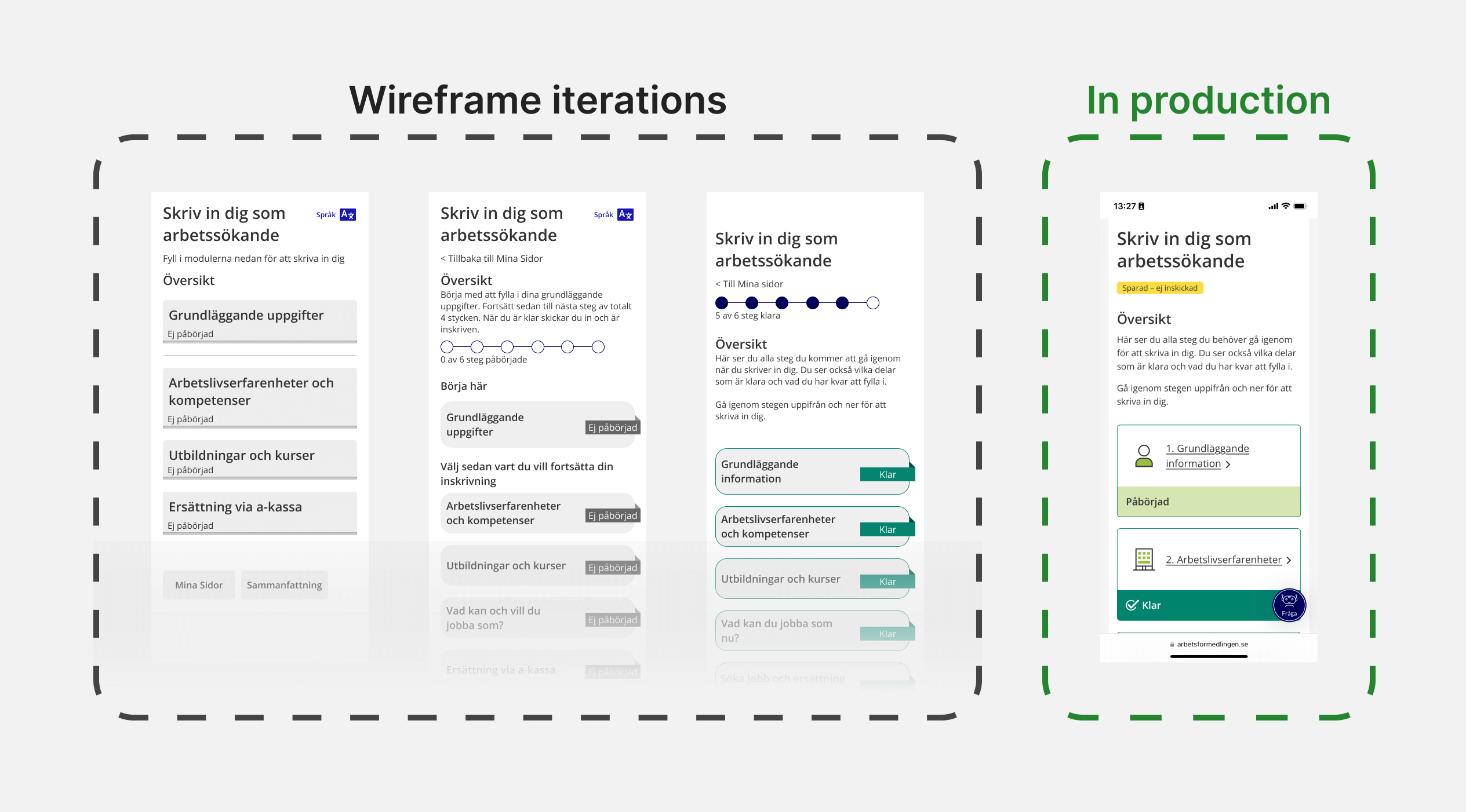
Arbetsförmedlingen has released the new version of “Skriv in dig”. It is quite exciting to see the results. It is clearly based on our work, and I will show some examples here.

